Description
Boost is a networking company active throughout United Kingdom. Boost focuses on delivering high-performing switches for enterprise networking clients and cloud providers. Boost ranks as one of the leading companies in United Kingdom. The goal was to give the brand a fresh look representing their reliability and high-speed network while maintaining basic policies of the company as reliability and stability.
Challenge
The company wanted to highlight their new feature in a logo, the company’s old logo was portrayed as a network that represented stability.
Design process
Brand Discovery
Our first motive in the logo design process was to understand what the brand represents and its goal. This phase is client discovery phase where we understand the real meaning of brand.
Brand Research
Now, in the second step, we take all the information from the discovery phase and conduct further research to draw insight that will serve us later for preparing the rough prototype.
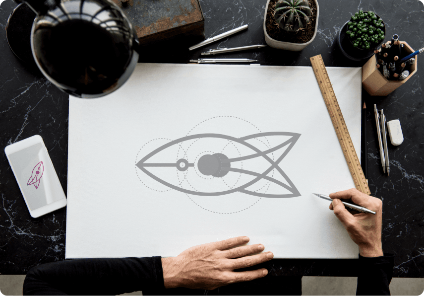
Sketching
Sketching logos is where the real creativity comes in to play, but since we have done our homework we are able to judge our sketches against clearly defined criteria.
Present and Deliver
This is the final phase where we combine our ideology and imagination for the brand and represent it to the client for his feedback.
Solutions
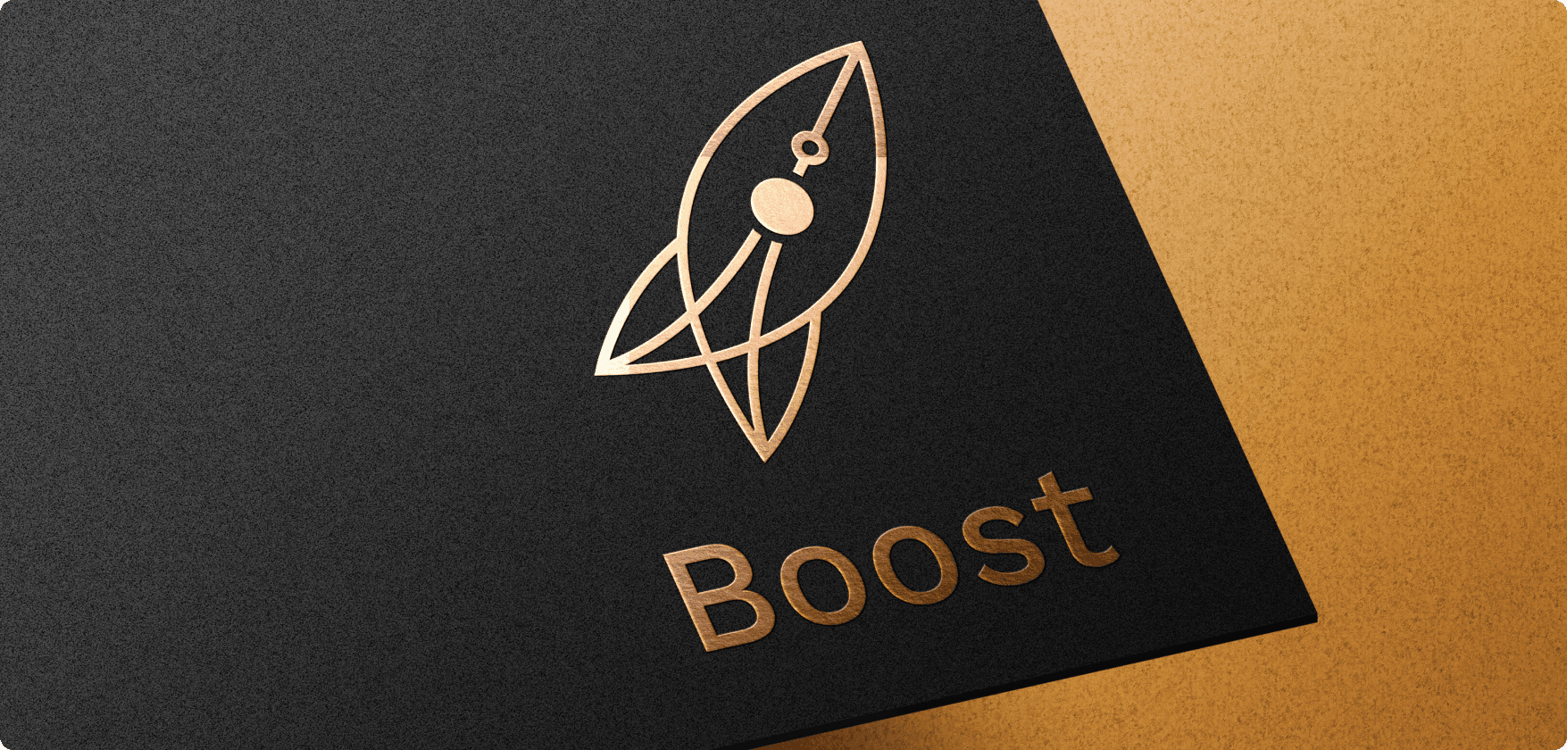
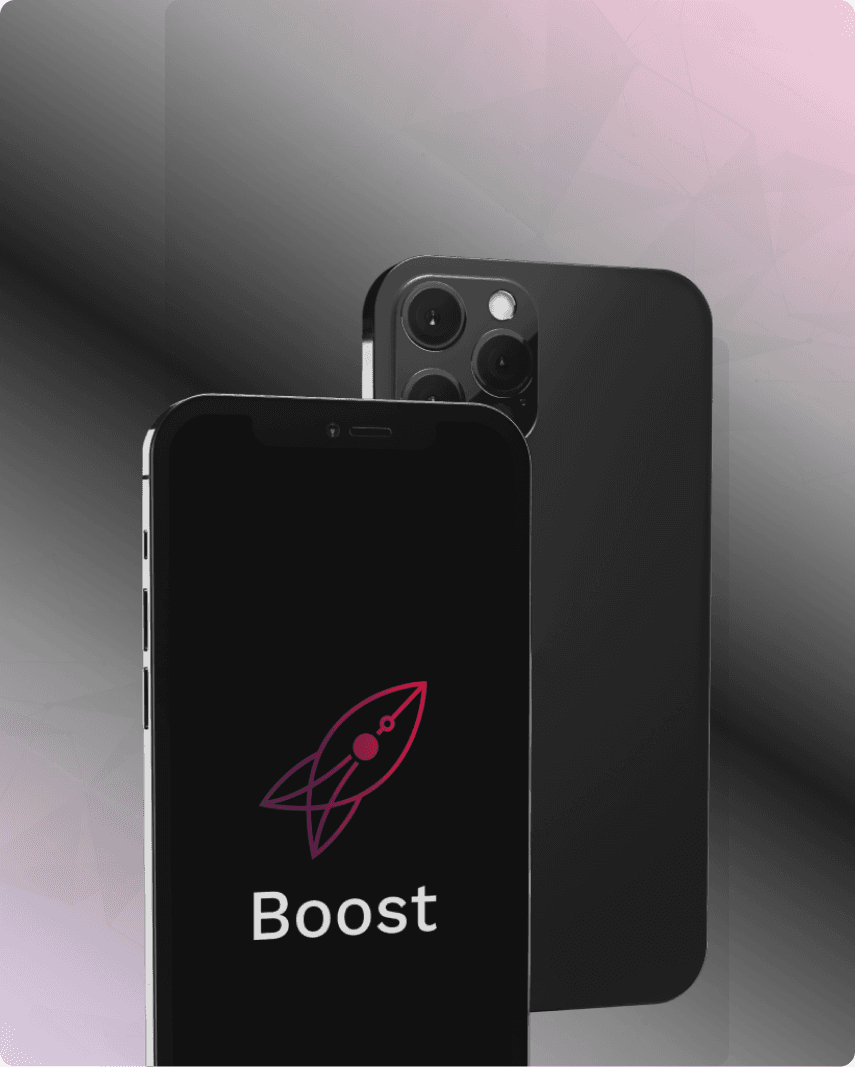
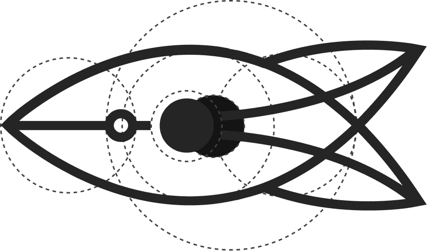
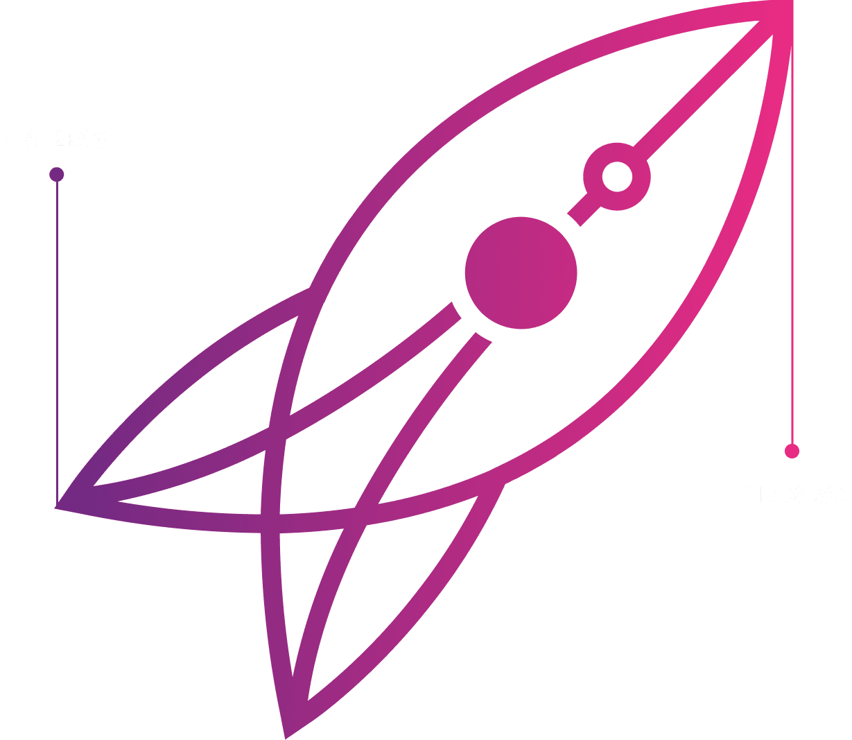
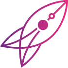
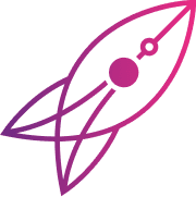
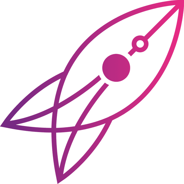
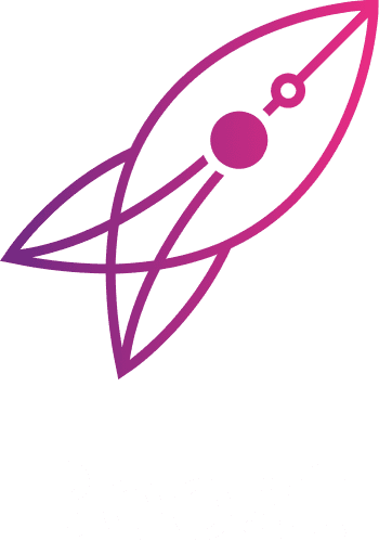
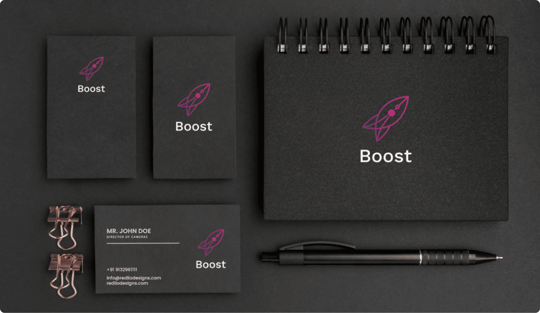
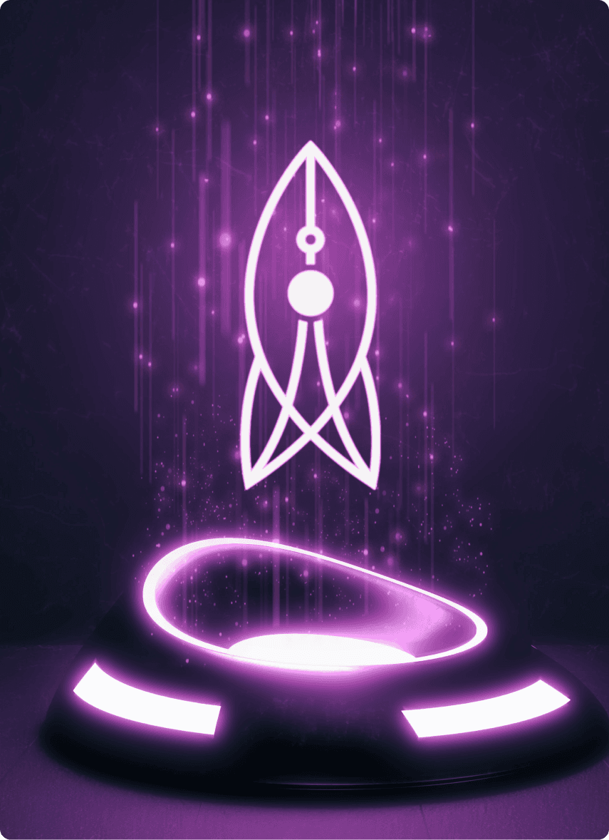
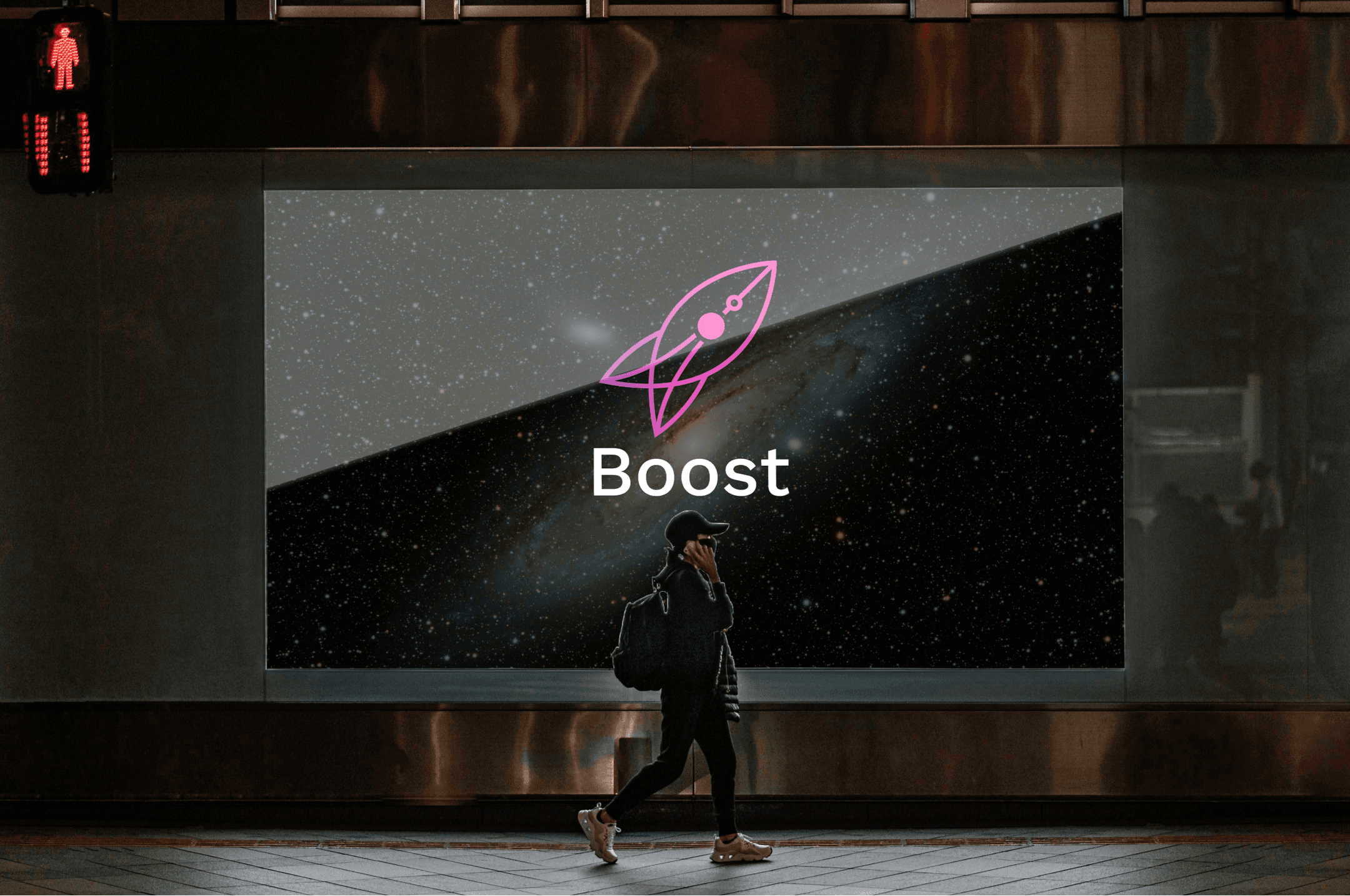
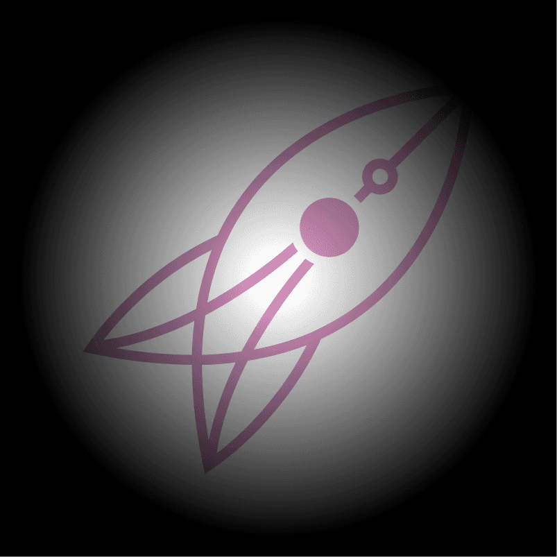
We built a whole new logo for the branding their concept of a high-speed network. We kept a significant rocket symbol that portrays speed. Now next challenge was to display the concept of networking along with it. The network is represented with three different strips connected with a node (sphere) that just links several distinct entities connected with one server. Boost logo is created with an attractive choice of colors that goes with both black and white backgrounds.
Brand icon
Brand icons are the visual expression of a brand and product, including their services and tools. Icons communicate the core idea and intent of a product in a simple, bold and friendly way. While each icon is visually distinct, all product icons for a brand are designed through concept and execution
Colors
Size variations


Connecting with everyone & everything.

Brad hood
OWNER and CEO
For Project Inquiries
Looking for career opportunity?

 Ahmedabad, Gujarat, India
406, 31FIVE Building, Corporate Rd, Prahlad Nagar, Ahmedabad, Gujarat - 380015